How to Create Eye-Catching Square Stickers for Your Brand
- Sticker Jet
- Dec 23, 2025
- 4 min read

Creating square stickers that truly stand out isn’t just about slapping a logo on a shape and calling it a day. When done right, square stickers can become powerful branding tools that catch attention, communicate personality, and stick in people’s minds (literally and figuratively). If you’re wondering how to design square stickers that people actually notice and remember, you’re in the right place.
Let’s walk through it step by step, in a simple, practical, and human way.

Why Square Stickers Work So Well for Branding
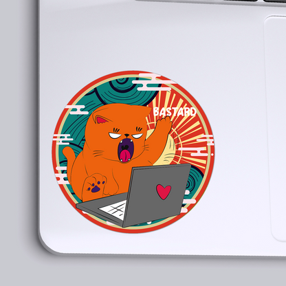
Square stickers are popular for a reason. Their clean edges and balanced shape make them incredibly versatile. They work beautifully for logos, QR codes, product labels, promotional messages, and even fun giveaways.
Unlike round stickers, square stickers give you more usable space. You can fit text, icons, and visuals without feeling cramped. This makes them perfect for brands that want clarity, structure, and a polished look.
Start With a Clear Purpose
Before you even think about colors or fonts, ask yourself one important question: What do I want this sticker to do?
Are your square stickers meant to:
Promote your brand
Label products
Add personality to packaging
Drive people to your website or social media
Be fun freebies customers stick on laptops or notebooks
Your goal will guide every design choice you make. A product label sticker will look very different from a promotional giveaway sticker, and that’s exactly how it should be.
Keep the Design Simple (But Not Boring)
One of the biggest mistakes brands make with square stickers is trying to do too much. Too much text, too many colors, too many ideas—all crammed into a small space.
Square stickers work best when the design is clean and focused. Choose one main message or visual and let it breathe. White space is your friend. It helps your design feel intentional and professional instead of cluttered.
If someone can’t understand your sticker in two seconds, it’s probably doing too much.
Use Colors That Match Your Brand Identity
Color plays a huge role in whether your sticker grabs attention or blends into the background. When designing square stickers, stick to your brand’s color palette as much as possible. Consistency builds recognition.
That said, contrast is key. Make sure your text stands out clearly against the background. Light text on a dark background or dark text on a light background usually works best.
If your brand colors are subtle, consider using bold accents to help your square stickers pop without losing brand consistency.
Choose Fonts That Are Easy to Read
Fancy fonts can look great in theory, but on a small sticker, readability always wins. Choose fonts that are clean, legible, and aligned with your brand’s personality.
If you’re using more than one font, keep it simple:
One font for the main message
One font for supporting text (if needed)
Avoid squeezing too much text into your square stickers. Short phrases, strong words, or a bold logo usually make the biggest impact.
Make the Most of the Square Shape
The square shape itself is a design advantage—use it intentionally. Centered designs often work beautifully on square stickers, creating balance and symmetry.
You can also play with:
Borders that frame the design
Corner elements that guide the eye inward
Full-bleed designs that go edge to edge for a bold look
Because square stickers have straight edges, they naturally feel more structured and modern. Lean into that strength rather than fighting it.
Pick the Right Size for the Job
Not all square stickers serve the same purpose, so size matters. Smaller square stickers work well for packaging seals or product labels. Medium sizes are great for promotions, while larger ones are perfect for branding and giveaways.
Think about where the sticker will be placed. A sticker meant for a box or bottle needs different proportions than one meant for a laptop or storefront window.
Designing with the final use in mind helps ensure your square stickers look great wherever they end up.
Don’t Forget About Material and Finish
Design isn’t just visual—it’s tactile too. The material and finish you choose can completely change how your square stickers feel and how people perceive your brand.
Glossy finishes feel bold and vibrant. Matte finishes feel modern and premium. Durable materials add value, especially if your stickers will be used outdoors or on products that get handled a lot.
When design and material work together, your square stickers feel intentional, not generic.
Test Before You Print in Bulk
Before committing to a large print run, it’s always smart to test your design. Print a small batch and see how the sticker looks in real life.
Ask yourself:
Is the text readable?
Do the colors look the way you expected?
Does it match your brand’s vibe?
Would you personally stick this somewhere?
Seeing your square stickers in hand often reveals small tweaks that make a big difference.
Use Square Stickers as Part of a Bigger Branding Strategy
The most effective square stickers don’t exist in isolation. They’re part of a bigger brand experience.
Use them on packaging, include them in orders, hand them out at events, or use them to reinforce your messaging across touchpoints. The more consistently people see your brand through square stickers, the more familiar and trustworthy it becomes.
Over time, these small details add up to strong brand recognition.
Final Thoughts
Designing eye-catching square stickers is about clarity, consistency, and connection. When you combine thoughtful design with your brand’s personality, square stickers become more than just stickers—they become tiny brand ambassadors working for you every day.
If you’re ready to turn your ideas into high-quality square stickers that reflect your brand perfectly, Stickerjet makes it easy to create designs that stand out and stick around.


Comments